Info
UX/UI Design Intern at Logos News, 2020
Design System from Scratch and in Figma
2 Months
Team
CEO – Oliver d'Abo-Hurwitz
PM – Alan Deng
Designers – Eric Siegel, Wen Chen, and Chien
Front-end Dev Team
If the teams collaborate better, could we deliver features faster?
As a team of a young startup, our focus is to ship the product features as fast as we can. However, the design outcomes from different design interns are various and have their unique style, which results in lower productivity for the dev team when they have to take care of each design detail.
How might we assist the teams to grow while designing and shipping a product that is young and fast-growing?
I built and supported the components part in our new design system
Our team of 3 design interns built a design system in collaboration with the CEO and PM. I was responsible for and devoted myself to:
→ Evangelizing the design system with the leadership, design and dev team
→ Creating the components and constructing the guideline, all in Figma
The system is well-received, provides consistent but feasible design components to use, ensures the efficiency, and enhances the communication between designers and developers. 🎉

We defined what our success would look like first
Our goal is to bring consistency and evoke coherence in the teams. After discussions with the leadership, I wanted to see the following results to make sure the project succeeds.
- The system is scalable and doesn't restrict team members' creativity
- The teams are willing to practice the system and refer back if needed
Starting from auditing current designs, we spoke with each unique voice
Either in our shipped product or ongoing designs, I noticed that we had several common components across the designs, but each had its rounded corner, font size, or interaction pattern, etc.

The systems from mature companies are all great, but...
It turned out each company is unique and has different goals and systems. We cannot just copy the practice and files from other company. However, there are a lot of learnings from looking exemplars, including how they layout a system, their naming convention, their messages of communicating a component or foundation.

- Because of our early-stage product, we decided to focus on constructing the design foundation and components first. Build patterns if necessary.
- For components with higher complexity like Cards, instead of having a determined style, we turned to building a well-defined foundation.
- Because of new Figma users in our company, we agreed to apply a flat structure rather than an atomic one to our component naming. Thus people can switch components more easily.
Scoping down to what we can do in five weeks
To make the most of our limited resources and time, we defined our principles and focus first. We wanted our design systems can bring these value to our company:
→ Consistency
→ Speed
→ Scalability
There are lots of things we can do for a design system, but we would like to first focus on the things that empower our design process and communication with developers. Among the tasks, I was responsible for components and its documentation, and a part of foundation.

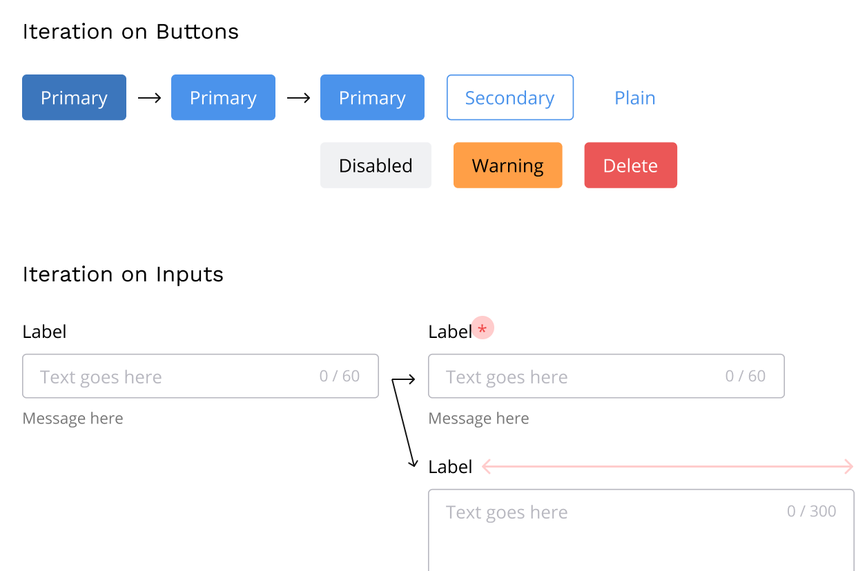
How I iterated the component design
After I learned how I could approach our design system, I started building it from common components across design interns. With an initial version of components, I published my designs and asked colleagues to use it and give me feedback. By doing so, I had a chance to learn from their real practices and fine-tuned the design in two directions:
- Discover unmet expectations and new use cases
- Align with our new foundation and grid guideline
Aligning to some of our current designs
After having some discussions with the CEO, we chose to not rebuild some components because of limited resource. By referring to our current designs, our developers can put less effort on rebuilding things. Major changes are:
- Shapes
- Dimension

Finally, 14 types of components enable our team to have a shared language and consistent designs
After several rounds of iteration, I started finalizing the components, including the color, font scale, states, etc. It ended up becoming the foundation of our design works. My outcome focuses on:
- Foundation: Spacing, Design Frame Size, Corner, Shadow
- Components: Buttons, Inputs, Checkbox, Radio Buttons, Switches, Avatar, Chips, Tooltip, Nav Bar, Reaction Bar
The set of components comes with three highlights. First, with the collaboration with designer Wen, we had our components pass AA guideline. Second, I made sure our components are responsive by using Auto Layout. Lastly, as you can see in the image, our designs across three people achieve a sense of consistency!

Also, to make the design system more digestible, I created the documentation and broke it down into 4 parts:
- Intro section for everyone to understand what are buttons, and when and where to use them
- Specs section for developers to see the details without using inspect feature
- How to Use section for our Figma novices to gain hands-on knowledge
- Components section for designers and other stakeholders to get building blocks

Besides crafting, I proactively spread the importance of the system as well
In any discussion, I sought to increase team member's awareness of the design system, including my components as well as the grid system and style guide from other folks. Thus, I would refer to the system while we discuss the design details, giving a link to specific components as well as presenting visual aids.

On the other hand, since Figma is a new tool for our team and the whole company, I focused on a lower learning curve. For example, I divided the documentation into distinct parts and provided tutorials. By doing so people can get the necessary information with a little software or design system knowledge.
Impact
I'm happy to see the design systems contribute to our workflow, designers applying the system in their design, and developers referring to the system for components' specs and use cases.

He [Chien] also made major contributions to our brand guide, specifically building out a comprehensive set of UI guidelines for our software developers to reference when doing front-end development. These UI guidelines have become a staple and our developers have had nothing but positive feedback. — Oliver d'Abo-Hurwitz, CEO at Logos News
It's never finished
Designing for growth is important for me. Since the current system focused on the foundation between design and development, we wanted to expand the design system in the following ways to enhance the collaboration between designers, developers, marketers, or leadership.
- Collecting data to measure the system, such as how components are being used, where they break down, and how they can continue to evolve
- Integrating the front-end codes that sync with the design
- Developing more components or patterns as new features created
Check the documentation of design system if you missed.